Days
Hours
Minutes
Seconds
Get 50% OFF My ChatGPT for Finance Video Course

Become an AI CFO in just 1 hour a week.

Future-proof your career with AI.

Join our FREE event this 29th July!

Join our FREE event this 29th July!

How to become an AI CFO.

Enrollment Ongoing: AI for Finance – Advanced (Live Course) – Limited Slots Available Enroll Now!

Excel

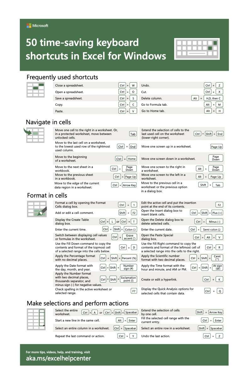
A Waterfall Chart is a type of data visualization that demonstrates how successive positive and negative values may add up to change an original value. You can use this graph to display category or sequential data. It employs a sequence of bars to display gains and losses, making it evident how an initial value was affected by circumstances and altered to become the final result.

A bridge chart, a Mario chart, and flying bricks charts are other names for it. This is because it resembles bricks dangling in the air like the character from the well-known video game. Nevertheless, the chart is occasionally referred to as a waterfall chart even though water does not flow upwards.

How Does A Waterfall Chart Work?

Your bar charts must all have the same baseline of zero, which is one of the very few unbreakable laws of data visualization. In a waterfall chart, this is still true, but it only holds true for the first bar, which displays the starting value, and the last bar, which displays the ending value. (Or the “before” and “after” values, if you want.)

The running total determines the baselines of the component bars that are interspersed between these totals, which are all distinct. The end of the preceding bar serves as the baseline for the bars in the center of a waterfall chart. Therefore, the look is that of a stairway linking two (or more) pillars that are climbing and descending.

How to Use A Waterfall Chart for Your Storytelling in Finance?

The most commonly used waterfall charts are for financial measures, including revenues, expenses, and profits. They are two different groups:

  • Categorical: emphasizing the steps in a procedure, such as adding revenues and deducting costs to arrive at profits
  • Change over time: displaying a single measure that increases and decreases over time, such as monthly profit and loss and the resultant yearly total

A normal column chart treats each month or category separately from the next, with each bar beginning at a baseline of zero. When the chart’s goal is to enable visual comparison of each bar’s height, this is ideal.

In comparison, it is more difficult to compare the sizes of the bars in a waterfall chart, but it is quite easy to observe how the cumulative total increases.

When Should You Not Use A Waterfall Chart?

If you have negative values, you should definitely avoid using a waterfall chart. This is a significant drawback of this graph. We cannot utilize the built-in waterfall chart if the total is negative.

How Can You Build A Waterfall Chart in Excel

Here are the simple steps to build a waterfall chart in Excel.

  1. Create a data table
  2. Add equations
  3. Create a stacked bar chart
  4. Hide the “Base” numbers
  5. Customize the chart

How Can You Build A Waterfall Chart in Google Sheets

  1.  Select your data
  2. Go to Insert, then click Chart or look at the near end of the main toolbar and click on the chart icon
  3. Google Sheets will automatically create a graph based on your data. If the chart is not on the waterfall chart type, go to the Chart Editor, which pops out at the right side of your google sheet, and select Setup. Under chart type, click the drop-down menu, then scroll down and look for the waterfall chart located under the subsection Other.
  4. You now have a waterfall chart.

Where Do Waterfall Charts Come into Play?

Real-Life Use Cases of Waterfall Charts in Finance

In the finance industry, waterfall charts are frequently used to illustrate how a net value is determined by decomposing the sum of positive and negative contributions.

To further grasp the situation, let’s use a straightforward example. An inventory audit of men’s t-shirts in a retail store would be the most straightforward example. Determine how many marketable t-shirts you have on hand to begin the next month. Usually, there will be a few units on hand to begin the month.

Some of the units will break while the t-shirt is on display and being worn by different individuals. Finally, we determine the number of units we can sell by considering whether some of these damaged units may be repaired and added to the stock.

The beginning value of “Units in stock” therefore undergoes a succession of ups and downs, one up and one down to be exact, to reach the end value of “Salable Units” in this waterfall chart (also known as the bridge chart). Waterfall Reporting is another name for this.

Is It Easy to Use It?

There are very simple and easy to understand. Because Westerners read from left to right, waterfall charts make use of this fact to logically display start and end dates. The first bar also serves as an excellent visual entry point by providing the observer with a comparison anchor right away.

Conclusion – Building in Excel

Waterfall charts are a great tool for showing how data has changed when used properly. This graph, whether categorized or dated, makes it obvious how an ending point was arrived at. They are a slick and efficient method of frequently using information transmission, particularly by financial institutions.

However, it is tricky to build them in Excel. Therefore, I have prepared a free and easy, ready-to-use Excel template for you. This template includes instructions, an illustrative example, and a blank table ready to use. Save time and use this template for your next Waterfall!

You can download the free template here: Waterfall Chart Template, and if you need more detailed instructions, here is a great video tutorial.

Finally, did you like this template? If you do, share it around, and don’t forget to subscribe to my newsletter to receive more templates from me.

Numerous keyboard shortcuts that Excel provides can help you operate more quickly and productively. More importantly, significant operations may be carried out with just two or three keystrokes rather than using the mouse to enter the toolbar. Isn’t that quicker and easier? Excel shortcuts significantly speed up work and cut down on the workload.

Therefore, Microsoft compiled 50 time-saving Excel Shortcuts (for Windows), which I will discuss today.

Time-Saving Excel Shortcuts

Here are the four types of time-saving Excel shortcuts.

Table in green and white colors of the 50-time saving Excel shortcuts.

Frequently Used Excel Shortcuts

Table of the Frequently Used Shortcuts

  • Close a spreadsheet – Ctrl + W
  • Undo – Ctrl + Z
  • Open a spreadsheet – Ctrl + O
  • Cut – Ctrl + X
  • Save a spreadsheet – Ctrl + S
  • Delete column – Alt + H, D, then C
  • Copy – Ctrl + C
  • Go to Formula tab – Alt + M
  • Go to the Home tab – Alt + H
  • Paste – Ctrl + V

Navigate in Cells

Table of Excel Shortcuts "Navigate in Cells"

  • Move one cell to the right in a worksheet. Also, in a protected worksheet, move between unlocked cells – Tab
  • Move to the last cell on a worksheet, to the lowest used row of the rightmost used column – Ctrl + End
  • Move to the beginning of a worksheet – Ctrl + Home
  • Move to the next sheet in a workbook – Ctrl + Page Down
  • Move to the previous sheet in a workbook – Ctrl + Page Up
  • Move to the edge of the current data region in a worksheet – Ctrl + Arrow Key
  • Extend the selection of cells to the last used cell on the worksheet (lower-right corner) – Ctrl + Shift + End
  • Move one screen up in a worksheet – Page Up
  • Move one screen down in a worksheet – Page Down
  • Move one screen to the right in a worksheet – Alt + Page Down
  • Move one screen to the left in a worksheet – Alt + Page Up
  • Move to the previous cell in a worksheet or the previous option in a dialog box – Shift + Tab

Format in Cells

Excel Shortcuts about "Format in Cells"

  • Format a cell by opening the Format Cells dialog box – Ctrl + 1
  • Add or edit a cell comment – Shift + F2
  • Display the Create Table dialog box – Ctrl + L or Ctrl + T
  • Enter the current time – Ctrl + Shift + Colon (:)
  • Switch between displaying cell values or formulas in the worksheet – Ctrl + Grave accent (`)
  • Use the Fill Down command to copy the contents and format of the topmost cell of a selected range into the cells below – Ctrl + D
  • Apply the Percentage format with no decimal spaces – Ctrl + Shift + Percent (%)
  • Apply the Date Format with the day, month, and year – Ctrl + Shift + Number sign (#)
  • Apply the Number format with two decimal spaces, thousands separator, and minus sign (-) for negative values – Ctrl + Shift + Exclamation point (!)
  • Check spelling in the active worksheet or selected range – F7
  • Edit the active cell and put the insertion point at the end of its contents – F2
  • Open the Insert dialog box to insert blank cells – Ctrl + Shift + Plus (+)
  • Open the Delete dialog box to delete selected cells – Ctrl + Minus (-)
  • Enter the current date – Ctrl + Semi-colon (;)
  • Open the Paste Special dialog box – Ctrl + Alt + V
  • Use the Fill Right command to copy the contents and format of the leftmost cell of a selected range into the cells to the right – Ctrl + R
  • Apply the Scientific number format with two decimal spaces – Ctrl + Shift + Caret (^)
  • Apply the Time Format with the hour and minute, and AM or PM – Ctrl + Shift + At Sign (@)
  • Create or edit a hyperlink – Ctrl + K
  • Display the Quick Analysis options for selected cells that contain data – Ctrl + Q

Make Selections and Perform Actions

  • Select the entire worksheet – Ctrl + A or Ctrl + Shift + Spacebar
  • Start a new line in the same cell – Alt + Enter
  • Select an entire column in a worksheet – Ctrl + Spacebar
  • Repeat the last command or action – Ctrl + Y
  • Extend the selection of cells by one cell – Shift + Arrow Key
  • Fill the selected cell range with the current entry – Ctrl + Enter
  • Select an entire row in a worksheet – Shift + Spacebar
  • Undo the last action – Ctrl + Z

Table of the 50 Excel time saving shortcuts

The Bottom Line – Excel Shortcuts Are A Huge Boost for Productivity

Using Excel shortcuts, or shortcut keys is a sometimes neglected way to increase efficiency while working with an Excel model. Furthermore, there are various keyboard shortcuts for Excel that may be utilized to boost productivity. First, start by using these 50 shortcuts, and you’ll see the difference right away.

Furthermore, if you want to receive more finance tips like this, feel free to sign up for my newsletter. If you subscribe, every two weeks, you will receive an email from where I share best practices, career advice, templates, and insights for Finance Professionals.

Key Takeaways

  • Excel provides numerous keyboard shortcuts that can significantly enhance speed and productivity.
  • Excel shortcuts allow for quick execution of operations, reducing reliance on mouse interactions.
  • Microsoft has compiled 50 time-saving Excel shortcuts for Windows users.
  • These shortcuts are categorized into frequently used functions, cell navigation, cell formatting, selections, and actions.
  • Utilizing Excel shortcuts can greatly improve efficiency and productivity while working on Excel models.

FAQ

1. What is the significance of Excel shortcuts?

  • Excel shortcuts offer a quicker and more efficient way to perform tasks, reducing the reliance on manual mouse-based interactions and boosting overall productivity.

2. How many Excel shortcuts are covered in the list?

  • The list comprises 50 Excel shortcuts that encompass frequently used functions, cell navigation, formatting, selections, and various actions.

3. How are the Excel shortcuts categorized?

  • The Excel shortcuts are categorized into four types: frequently used functions, cell navigation, formatting in cells, and making selections and performing actions.

4. How can Excel shortcuts be beneficial for users?

  • Utilizing Excel shortcuts streamlines the work process, allowing users to perform tasks with just a few keystrokes. This can save time, reduce repetitive actions, and enhance overall efficiency.

Excel Charts assist you in displaying your data in a variety of appealing styles, including columns, lines, bars, pies, and areas, among others. It’s always about how we display the data that determines how fantastic a result we can produce with it. Excel charts and various bar graphs are helpful in this regard. In order to show our data as effectively as possible, we may also alter our graphs in Excel.

You can customize your Excel charts at all times to make sure your data is presented as persuasively as possible. And when I refer to personalization, I am not referring to significant major changes. I am speaking about an excellent tutorial from Microsoft. You get ten tips to make charts in a faster and simpler way.

Top 10 Tips for Excel Charts

This tutorial trains you with the following tips:

  1. Quick Chart Creation: Learn to instantly bring your data to life using the ALT+F1 shortcut, saving precious time in your financial analysis.
  2. Selective Visualization: Master the art of selecting specific columns before chart creation, ensuring that only the most relevant data is showcased for your financial storytelling.
  3. Dynamic Expansions: Discover how to automatically expand your graphs as you add more columns or rows, keeping your financial charts always up-to-date without manual adjustments.
  4. Efficient Data Filtering: Gain insights on quickly filtering data directly from a chart, enabling you to focus on specific financial metrics or periods without altering your entire dataset.
  5. Leveraging PivotCharts: When your data isn’t summarized, PivotCharts become an invaluable tool for creating dynamic visual representations of complex financial data.
  6. Multi-level Labels: Enhance readability with multi-level labels, perfect for organizing detailed financial data into clear and understandable charts.
  7. Secondary Axis Utilization: Learn to create compelling combo charts using a secondary axis, which is ideal for comparing different types of financial data on the same chart.
  8. Dynamic Chart Titles: Connect your chart titles to spreadsheet cells, allowing for automatic updates and ensuring that your financial presentations are always accurate.
  9. Pie Chart Insights: Split off slices into a second pie chart for a detailed examination of specific segments, enhancing the clarity of financial distributions.
  10. Interactive Previews: Utilize the hover feature over Chart Elements for a real-time preview, making it easier to fine-tune your financial charts before finalizing them.

How Can Excel Charts Improve Your Work

In finance, where data drives decisions, Excel charts stand out as not merely tools for data visualization but as essential instruments for analysis, communication, and strategy. Understanding how to leverage Excel charts effectively can significantly enhance your work by:

  • Enhancing Data Comprehension: Complex financial data becomes more digestible when presented visually. Excel charts help break down intricate datasets into understandable formats, making it easier to identify trends, patterns, and outliers.
  • Facilitating Better Decision-Making: By visualizing financial data, you can make informed decisions swiftly. Charts allow for a quick comparison of different data points, enabling financial analysts and decision-makers to identify potential investment opportunities or financial risks at a glance.
  • Improving Communication: Financial reports filled with numbers and text can be daunting. Excel charts offer a way to convey the same information more effectively, making it easier for stakeholders to grasp key messages and insights without getting lost in the details.
  • Saving Time: With the capability to quickly generate and customize charts, Excel allows for efficient data presentation. This means less time creating reports and more time on analysis and strategy.
  • Increasing Accuracy: Visual representations help in spotting errors in data that might not be evident in a tabular format. By plotting financial data on a chart, inconsistencies or anomalies become more apparent, leading to more accurate financial analysis.
  • Customizing for Impact: Excel’s wide range of chart types and customization options means you can tailor your data presentation to your specific audience. Whether it’s a line chart to demonstrate financial trends over time or a pie chart to show budget allocations, Excel charts can be customized to achieve the desired impact.

Conclusion

You may start making better-looking charts in Excel more quickly and efficiently by using the charting tips and methods. However, these tips and techniques are just a portion of the material I provide in my customized course for finance professionals, where I teach them how to produce understandable visual representations of financial data and valuable finance knowledge.

You can get the tutorial Excel file by clicking here and start training yourself to improve making charts in Excel and if you want to improve your productivity in Excel, grab my free top 100 Excel tips.

FAQ

1. What are the key benefits of using Excel charts in financial analysis?

  • Excel charts offer several key benefits in financial analysis, including enhancing data comprehension by breaking down complex datasets into visual formats, facilitating quicker decision-making through visual comparison of different data points, improving communication with stakeholders by presenting data in a more digestible manner, saving time on report creation, increasing the accuracy of financial analysis by making inconsistencies more apparent, and allowing customization to tailor presentations to specific audiences.

2. How can I quickly create a chart in Excel for my financial data?

  • You can quickly create a chart by selecting your data and pressing the ALT+F1 shortcut. This instantly generates a chart, bringing your data to life and saving precious time in your financial analysis. This shortcut is particularly useful for rapid visualization of financial trends and metrics.

3. Can Excel charts automatically update when I add more data?

  • Yes, Excel charts can automatically update as you add more columns or rows to your dataset. This feature, known as dynamic expansions, ensures that your financial charts remain up-to-date without the need for manual adjustments. It’s particularly useful for financial analysts who continuously update their data with new financial periods or metrics.

4. How can I use Excel charts to improve communication in my financial reports?

  • Excel charts improve communication by converting complex financial data into visually appealing and understandable formats. This makes it easier for stakeholders to grasp key messages and insights without delving into dense numerical data. By using charts, you can highlight trends, patterns, and anomalies in your financial data, making your reports more effective and engaging.

5. What is a PivotChart, and when should I use it in finance?

  • A PivotChart is an advanced Excel tool that allows you to create dynamic visual representations of complex datasets. It’s especially valuable when your data isn’t summarized and you need to analyze it from different perspectives. In finance, PivotCharts are useful for summarizing large amounts of financial data, such as sales figures, financial performance indicators, or investment returns, enabling you to drill down into specifics and uncover insights that would be difficult to spot in traditional charts.

You need to use Excel in your everyday job if you want to manage massive amounts of data. However, there are still a lot of helpful Excel tips and tricks that are definitely missed.

Even if you think that you have mastered Excel, I recommend you to visit the website of John MacDougal, “How to Excel,” where you will certainly learn something which will help your productivity (and will give you the possibility to impress your colleagues’ thanks to your new Excel skills).

Therefore, here is one of the best posts where he presents a compilation of the best Excel tips and tricks ranging from beginner to pro that will save you time and make you more productive.

Excel Tips and Tricks

Here is just one new trick that I learned today.

If you right-click and drag a range instead of the usual left-click, then you’ll able to do more than just cut and paste. In addition, a whole menu of advanced options is available.

  • Move Here – This will cut and paste the selection to the new location.
  • Copy Here – This will copy and paste the selection to the new location.
  • Copy Here as Values Only – This will copy and paste only the values to the new location.
  • Copy Here as Formats Only – This will copy and paste only the formatting to the new location.
  • Link Here – This will create a simple cell reference formula for the old location in the new location.
  • Create Hyperlink Here – This will create a hyperlinked cell reference to the old location in the new location.
  • Shift Down and Copy – This will copy and paste the selection to the new location and shift down any previous data in the new location.
  • Shift Right and Copy – This will copy and paste the selection to the new location and shift right any previous data in the new location.
  • Shift Down and Move – This will cut and paste the selection to the new location and shift down any previous data in the new location.
  • Shift Right and Move – This will cut and paste the selection to the new location and shift right any previous data in the new location
  • Cancel – This will cancel the action

The Bottom Line – Mastering Excel Is Necessary

In conclusion, mastering Excel tips and tricks can greatly improve your productivity and efficiency when working with spreadsheets. Therefore, by learning how to use functions and formulas, create graphs and charts, and utilize keyboard shortcuts, you can save time and effort when working with data in Excel.

If you want to receive more finance tips like this, feel free to sign up for my newsletter. As a result, if you subscribe, every two weeks, you will receive an email from which I share best practices, career advice, templates, and insights for Finance Professionals.

A To-Do list is simply a list of tasks that you need to complete. In other words, just much anything and everything may be on your To-Do list.

However, just because you’ve written your tasks down doesn’t imply they’ll actually be done.

You can prioritize your tasks and do excellent work by keeping track of when your assignments are due. The purpose of a To-Do list is to help a person stay organized and prioritize their tasks.

Benefits of Using A To-Do List

There are many benefits to using a to-do list for finance professionals:

  1. Improved productivity: A to-do list allows a person to focus on the tasks at hand and avoid distractions. By having a clear list of tasks, a person can work more efficiently and effectively.
  2. Better time management: A to-do list helps a person plan their time more effectively. By identifying the most important tasks and prioritizing them, a person can ensure that they are using their time efficiently.
  3. Enhanced organization: This list helps a person keep track of all their tasks in one place rather than relying on their memory. This can help a person stay organized and avoid missing important deadlines or tasks.

How to Use A To-Do List?

To use a to-do list, a person can simply write down the tasks they need to complete on a piece of paper or in a digital tool. Some people like to organize their lists by priority or by the due date. You can also use a to-do list to track their progress and mark tasks as complete when they are finished.

  1. Open Excel and create a new spreadsheet.
  2. Create a column for the task name and a column for the due date. You can also add additional columns for other details, such as the priority of the task or the person responsible for completing it.
  3. Enter the tasks and their corresponding details in the appropriate columns.
  4. To mark a task as complete, you can use a checkmark symbol or a different font color. You can also create a formula to automatically mark tasks as complete when the due date has passed.
  5. If you want to sort your to-do list by priority or due date, you can use Excel‘s sorting feature. To sort your list, select the data you want to sort and click the “Sort” button in the “Data” ribbon.
  6. To view only the tasks that are still outstanding, you can use Excel’s filter feature. To filter your list, click the “Filter” button in the “Data” ribbon and select the criteria you want to use to filter your tasks.

Conclusion

In conclusion, a to-do list is a simple yet powerful tool that can help you manage your time, stay organized, and accomplish your goals. By breaking down tasks into smaller, actionable items and prioritizing them, you can better focus on what needs to be done and feel a sense of accomplishment as you check items off your list.

Therefore, it’s important to regularly review and update your To-Do list to ensure that you are making progress and not missing any important deadlines. With a well-crafted to-do list and a little bit of discipline, you can achieve great things and live a more productive and fulfilling life. By using Excel to create and manage your to-do list, you can easily track your tasks, prioritize them, and stay organized.

Here is a great To Do List by Jon Macdougall, the Excel MVP. Use it for yourself, for your team, for your meetings, or for project management with other people. You can tailor this template and take the habit of using it instead of redoing the design of your To-Do List each time you create a new one.

If you want to receive more finance tips like this, feel free to sign up for my newsletter. If you subscribe, every two weeks, you will receive an email from where I share best practices, career advice, templates, and insights for Finance Professionals.

After my seven years as an auditor, I thought that I knew most of the important functions of Excel until I saw the Slicer function.

If you are working with Pivot Table, if you are filtering tables to create reports, or if you need to build a dynamic dashboard, you will love this function.

What is Slicer?

A slicer is a tool that enables users to utilize buttons to filter Pivot Tables or Excel Tables. A slicer does the same task as filtering a list with filter controls.

On the other hand, Slicers offer big, friendly buttons that are constantly visible in place of drop-down menus.

The buttons are generated automatically using data values.  In addition to filtering out the data, Slicers assist you in easily comprehending the information retrieved and shown on the screen.

Below are examples and a tutorial to learn how to integrate slicers. Believe me, it is really easy!

Here are examples of how it helps you.


How Do You Use Slicer Function in Excel?

Here are some examples of how to use it:

Conclusion – Slicer Function Can Boost Your Efficiency

Slicers offer multiple benefits to simplify life while performing real-time data analysis in Excel. Therefore, here are some significant advantages:

  • Together with formulas, the Slicer formulas are simple to copy or move to various tables.
  • Slicers replace the brute-force approach of manually filtering the data by making it simple and quick to obtain the needed information in a short amount of time.
  •  Excel’s slicers help to protect data security and integrity since the user is only interested in filtering out the essential information and not tampering with the actual data.

If you want to receive more finance tips like this, feel free to sign up for my newsletter. If you subscribe, every two weeks, you will receive an email from which I share best practices, career advice, templates, and insights for Finance Professionals.

Free Download

Download This Guide Absolutely Free.

You will be subscribed to my newsletter. Unsubscribe at any time.

Free Download

Enter Your Email Address Below to Start Your Download.

You will be subscribed to my newsletter. Unsubscribe at any time.

Free Download

Enter Your Email Address Below to Start Your Download.

You will be subscribed to my newsletter. Unsubscribe at any time.

Free Download

Enter Your Email Address Below to Start Your Download.

You will be subscribed to my newsletter. Unsubscribe at any time.

Free Download

Enter Your Email Address Below to Start Your Download.

You will be subscribed to my newsletter. Unsubscribe at any time.

Free Download

Enter Your Email Address Below to Start Your Download.

You will be subscribed to my newsletter. Unsubscribe at any time.

Free Download

Download This Resource Absolutely Free.

You will be subscribed to my newsletter. Unsubscribe at any time.

Free Download

Get This Guide Absolutely Free.

You will be subscribed to my newsletter. Unsubscribe at any time.