
Imagine you work in the finance department of a supermarket, and your boss asks you for an analysis of which product promotions were successful this year and which ones weren’t.
If you’ve never done this type of analysis before, it might seem overwhelming.
But what if I told you that combining ChatGPT with Excel could make your job much easier and help you become irreplaceable at work?
In this blog,I’ll walk you through how you can use ChatGPT and Excel together to simplify your workflow.
I’ll share practical examples that you can apply right away, along with a trick that lets you leverage ChatGPT without sharing any confidential data.
Ready to boost your productivity? Let’s dive in!
Watch my YouTube Video
In this video, I explain how you can use ChatGPT to 10X your Excel skills as a finance professional.
Click on the GIF to watch it.

Boost your Productivity by Using ChatGPT with Excel
Here are the steps on how you can increase your productivity by 10x:
#1: Identifying KPIs Without Sharing Confidential Data
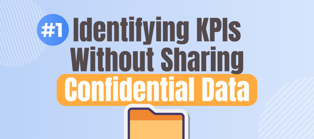
The key to using AI like ChatGPT without compromising confidentiality is the clever use of data headers.
For example, you have an Excel file that contains product names, revenue from last year and this year, as well as details about promotions during those years.
Instead of uploading the whole dataset to ChatGPT, you simply provide the headers: “Product,” “Revenue Last Year,” “Revenue Current Year,” etc.
This way, ChatGPT can understand the context without accessing sensitive numbers, which helps keep your data secure.
After you provide the headers, you can ask ChatGPT to suggest relevant KPIs for analyzing the promotion performance.
#2: Choosing the Right KPIs for Promotion Analysis
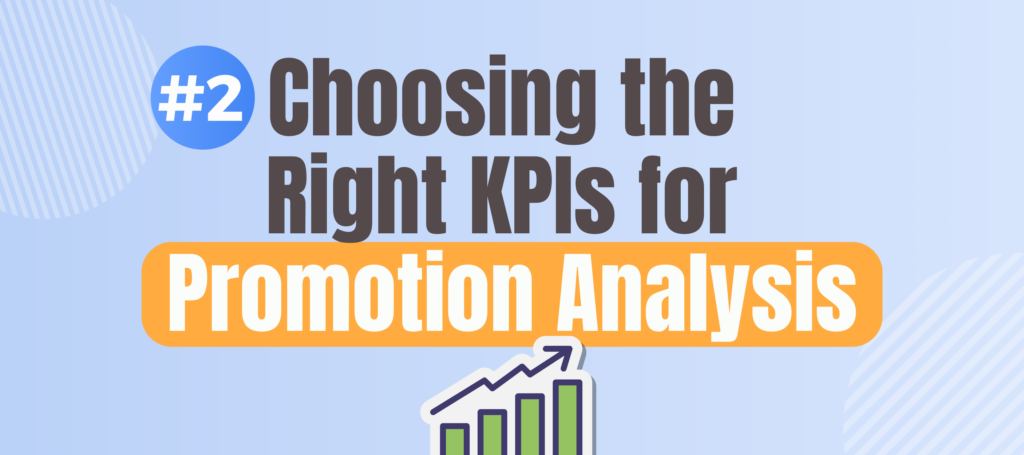
After inputting the headers, ChatGPT suggested several potential KPIs, including:
- Promotion Effectiveness
- Revenue Growth Rate
- Promotion Spending Growth Rate
- Revenue to Promotion Ratio
- Incremental Revenue per Unit of Promotion
Each of these KPIs tells you something different about how the promotions performed, but I found the last one particularly interesting because it helps identify how much additional revenue was generated for every dollar spent on promotions.
I then asked ChatGPT how to calculate this KPI in Excel.
#3: Getting the Right Excel Formula from ChatGPT
ChatGPT provided a detailed explanation and even gave me an Excel formula to calculate the incremental revenue per unit of promotion.
What I found most useful was that ChatGPT also assumed certain columns for the data (e.g., “Revenue Last Year” in Column D).
I double-checked my Excel file to ensure that these columns matched, and they did, so I used the formula directly.
After entering the formula, I formatted the results, and just like that, I had the incremental revenue per unit of promotion for each product.
This KPI allowed me to quickly see which promotions were effective and which weren’t.
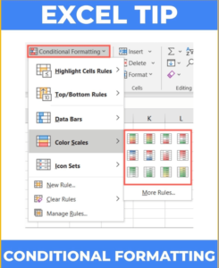
#4: Making the Data Speak: Conditional Formatting
But numbers alone can be overwhelming, especially if you have dozens of products to analyze. That’s where conditional formatting in Excel becomes a powerful ally.
I asked ChatGPT how to highlight the best and worst-performing promotions, and it suggested using conditional formatting.
With conditional formatting, I applied a color scale to the KPI column, making it easy to see which products performed well (in blue) and which did poorly (in red).
For instance, it was immediately clear that while walnuts had a high return on promotion, sodas didn’t perform as well.
#5: Visualizing the Results with Graphs

If you’re dealing with a lot of data, it can be challenging to communicate your findings effectively.
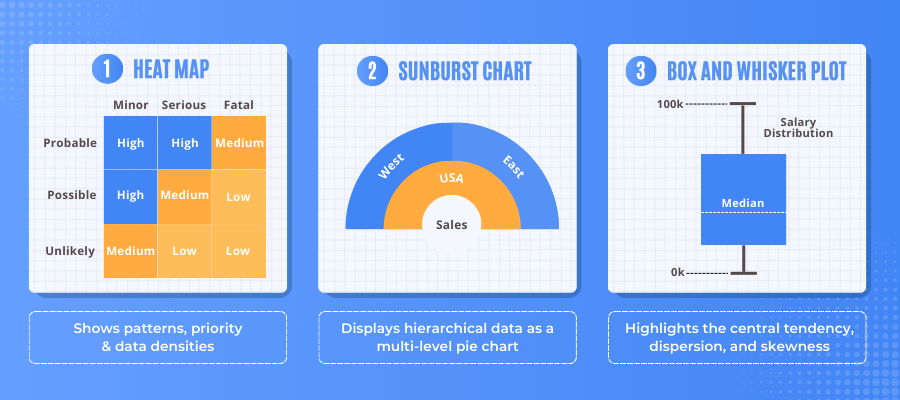
To make the data more digestible, I asked ChatGPT which graph would be best to represent the KPI data for all 50 products (SKUs).
It suggested a few options, such as a bar chart, scatter plot, and heat map.
Based on my experience, I decided to go with a scatter plot because it clearly shows the relationship between promotional spending and revenue performance.
ChatGPT even guided me step-by-step on how to create the scatter plot and label each point with the corresponding product name, making it easy to identify which products were overperforming or underperforming.
#6: Interpreting the Graph for Insights
Once the scatter plot was ready, I wanted to understand what it meant for each product. I used ChatGPT again, asking how to interpret the graph.
The AI provided a helpful explanation that showed me which products had high promotional spending but low returns and vice versa.
For example, I noticed that walnuts were performing exceptionally well—we didn’t spend much on promoting them, but they generated a lot of additional revenue.
On the other hand, chicken promotions didn’t fare as well. I even filtered the data to focus on just the meat category, allowing me to compare beef and chicken directly.
Practical Tips for Your Next Analysis
- Use Headers Only: Always provide headers instead of confidential data when using AI tools.
- Conditional Formatting: Make large datasets easier to understand by color-coding key metrics.
- Visualize with Scatter Plots: Use scatter plots for clear visual representation, especially when analyzing multiple products.
- Ask ChatGPT for Explanations: Don’t hesitate to ask ChatGPT how to explain complex metrics to your boss or team.
Watch my YouTube video on how you can use ChatGPT to 10X your Excel skills as a finance professional by clicking here.
Wrapping Up
In just a few minutes, we used ChatGPT to identify the right KPIs, calculate them, visualize the results, and even interpret the data.
By combining ChatGPT with Excel, you can not only make data analysis easier but also become more valuable to your organization.
With this method, you will quickly deliver insights that drive better decision-making.
If you want to continue improving your skills and stay ahead in corporate finance, I have something for you.
I’ve created a free 5-day email course covering how to get the most out of AI tools like ChatGPT. Click here to enroll!
FAQ
Q: How can I use ChatGPT with Excel without compromising data security?
A: You can use headers instead of actual data, which allows ChatGPT to understand the context without accessing confidential information.
Q: What are the best KPIs to analyze promotion performance in Excel?
A: Some effective KPIs include Promotion Effectiveness, Revenue Growth Rate, and Incremental Revenue per Unit of Promotion.
Q: How can I visualize KPI data effectively in Excel?
A: Scatter plots, bar charts, and heat maps are great for visualizing relationships between data points, especially for promotion analysis.
Q: How can I highlight the best and worst promotions in Excel?
A: Use conditional formatting to color-code KPIs, making it easier to see which promotions performed well and which didn’t.
Q: How does ChatGPT help explain complex metrics?
A: ChatGPT can provide clear explanations and even suggest how to present metrics to your boss or team in an understandable way.