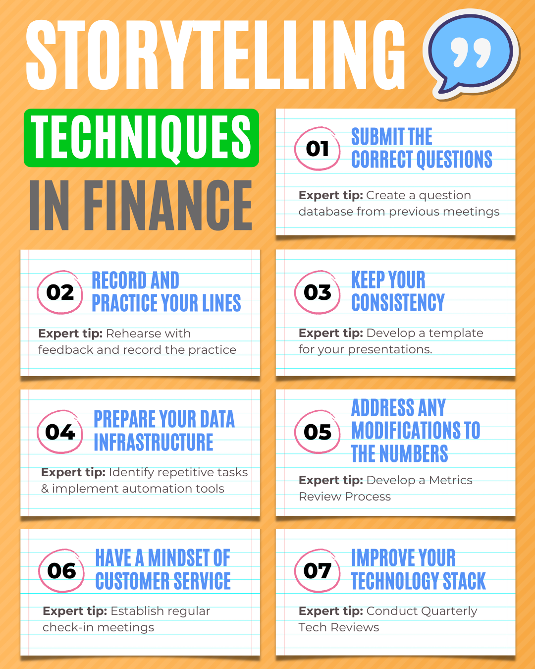
We hear a lot these days about how finance pros should focus more on storytelling. For many of us, it sounds daunting.
“I’m here to make sense of numbers, not write stories!”
But here’s the thing – storytelling in finance isn’t new. It’s something we’ve always done.
Think about those board meetings where we explain why the numbers look a certain way or those financial reviews where we connect the dots between performance and strategy. That’s storytelling.
My goal here is simple: take the pressure off and show you that, as finance professionals, you already have everything you need to tell compelling stories. You just need to sharpen them a bit.
Let’s make this easier together.
Why Is Financial Storytelling Important?
Financial storytelling is important because it helps organize and explain financial data. It provides context, highlights key points, and offers practical advice based on the information.
By presenting the data clearly, finance professionals can build trust with clients and stakeholders, showing they not only understand the numbers but can also communicate their meaning effectively.
Today, clients expect more than just raw data—they want to understand how it affects their business or personal goals.
Financial storytelling helps connect the dots and make the information relevant to them.
The Phases of Financial Storytelling

Here are the phases and steps you need to follow in order to master financial storytelling.
#1: Define Your Audience

The first step in financial storytelling is to define your audience. Who are you presenting to, and what do they need to know? Understanding your audience will help you tailor your message to their needs and make it more engaging.
For example, if you’re presenting to executives, you may need to focus on the high-level implications of the data, whereas if you’re presenting to investors, you may need to provide more detailed information.
How can you improve it?
Ask questions and gather information about your audience beforehand to tailor your message to their needs.
#2: Identify The Key Points

Once you know your audience, you need to identify the key points that you want to communicate. These should be the most important findings, recommendations, or insights from your analysis.
It’s important to focus on the most critical data and avoid overwhelming the audience with too much information.
Don’t rely solely on the numbers. Data without context can lose its meaning. Always explain why certain metrics are important.
For example, if revenue has increased, provide insight into the key drivers—whether it’s a new product launch or market expansion—so your audience understands the why behind the data.
How can you improve it?
Focus on the most important findings, recommendations, or insights from your analysis, and avoid overwhelming the audience with too much information.
#3: Create A Narrative

Once you have identified the key points, you need to create a narrative that ties them together. This narrative can be a story or a logical sequence of events leading to your recommendations.
The narrative should be engaging and easy to follow, helping the audience understand the context and relevance of the data.
To create an effective narrative, you should consider the following:
- Start with a clear introduction that sets the scene and provides context for the data.
- Identify the key challenges or opportunities that the data presents.
- Develop a story that connects the data to the challenges or opportunities and leads to your recommendations.
- Use anecdotes or examples to illustrate your points and make the narrative more relatable.
- Keep the narrative concise and focused on the key points.
Financial storytelling is not only about what has happened but also about what will or could happen.
Providing projections or forecasts can help decision-makers understand the future impact of current trends.
How can you improve it?
Use storytelling techniques to make your message more engaging and easy to follow. Consider using anecdotes or examples to illustrate your points.
#4: Use Data Visualization

Data visualization is an essential tool in financial storytelling. It can help to illustrate your points and make the data more accessible and engaging. Use charts, graphs, and other visual aids to present your data in a way that’s easy to understand.
However, it’s important to use data visualization judiciously and avoid overwhelming the audience with too many charts or graphs.
To use data visualization effectively, you should consider the following:
Avoid over-relying on charts and graphs without a clear narrative. Visuals are tools that should complement your story.
Ensure each graph or chart directly ties into the key message you’re trying to communicate.
A well-placed chart that is clearly explained can reinforce your insights, while too many can overwhelm your audience
How can you improve it?
Choose the most appropriate visualization for the data and ensure that it’s easy to read and understand. Avoid clutter and unnecessary detail.
#5: Practice

Practice is critical in financial storytelling. Rehearse your presentation, and get feedback from others to refine your message and delivery. Pay attention to your tone of voice, body language, and pacing. Use a timer to ensure that you’re staying within the allotted time frame.
Practicing will help you feel more confident and prepared, and it will also help you identify areas where you need to improve.
How can you improve it?
Rehearse your presentation, get feedback from others, and use a timer to ensure that you’re staying within the allotted time frame.
#6: Review and Refine

After you’ve practiced your presentation, review it and refine it. Look for areas where you can simplify your message or make it more engaging.
Consider feedback from others, and be willing to make changes if necessary.
How can you improve it?
Look for areas where you can simplify your message or make it more engaging. Consider feedback from others, and be willing to make changes if necessary.
#7: Deliver with Confidence

Finally, when it’s time to deliver your presentation, be confident and engaging. Use your narrative and data visualization to illustrate your key points and make a compelling case. Pay attention to your audience’s reactions, and be willing to adjust your presentation if necessary.
How can you improve it?
Rehearse thoroughly, understand your data inside and out, and use your narrative along with data visualizations to make a compelling case.
Stay attuned to your audience’s reactions, and be ready to adjust your presentation as needed to ensure it resonates effectively
Good vs Bad PowerPoint Presentation
A good PowerPoint presentation is crucial in engaging your audience and communicating your message effectively.
After creating over 10,000 slides throughout my career, I’ve learned a lot about what works and what doesn’t.
Being responsible for crafting presentations has given me a valuable seat at the table in management discussions.
Here are my top tips for creating an impactful presentation.
Titles
One of the common mistakes is using vague, non-specific titles that fail to communicate the main idea. A good title should be direct and purposeful, guiding your audience’s focus to the key point of each slide.
Text
Overloading your slides with text is another frequent issue. Filling slides with paragraphs diminishes clarity and overwhelms the audience. Instead, keep your text concise and focus on key points that complement your spoken presentation.
Images
Using poor-quality or irrelevant images can detract from the professionalism of your slides. High-quality, relevant images help reinforce your message and keep your audience engaged.
Layout
A cluttered layout packed with too much information can lead to confusion. Ensure your slides have adequate white space, making them visually pleasing and easy to follow.
Visualization
Reading slides verbatim is a surefire way to lose your audience’s attention. Instead, use charts and graphs effectively to visualize data and enhance understanding.
Colors
Inappropriate color combinations can make text difficult to read, hurting the overall effectiveness of your presentation. Use contrasting colors for text and background to ensure readability.
Font
Small font sizes make it hard for your audience to follow along, especially from a distance. Choose an appropriate font size that ensures readability from anywhere in the room.
Animations
Overusing flashy animations can distract from the content. Opt for subtle animations and transitions to maintain attention without diverting focus from the message.
Structure
A lack of structure can leave your audience confused and unsure of the message. Ensure your slides have a logical flow, progressing from one idea to the next in a clear and sequential manner.
Closing Remarks
Financial storytelling might sound challenging, but it’s something you’re already doing as a finance professional.
By focusing on sharpening these skills – defining your audience, highlighting key points, and using engaging narratives—you can transform numbers into powerful stories that guide better decisions.
And remember, the more you practice, the better you’ll get!
FAQ Section
1. What is financial storytelling?
Financial storytelling is the process of using data and analysis to create a narrative that helps explain financial results. It’s about connecting the numbers to a bigger picture, making it easier for others to understand the context, challenges, and opportunities.
2. Why is financial storytelling important for finance professionals?
It’s important because it helps finance professionals communicate the meaning behind the numbers. It allows them to build trust by showing that they can not only analyze data but also explain how it impacts business decisions. This skill is becoming increasingly essential as stakeholders expect more than just data—they want insights that guide their strategies.
3. How do you create a good financial story?
To create a good financial story, start by defining your audience, identifying the key points, and building a narrative around them. Use data visualization tools like charts and graphs to make the information clear and engaging. Practice and refine your delivery to ensure you present with confidence.
4. What role does data visualization play in financial storytelling?
Data visualization plays a critical role because it helps translate complex data into easily understandable visuals. Charts, graphs, and diagrams can highlight key trends, make comparisons, and simplify the data. However, it’s essential to use them wisely and avoid cluttering your presentation with too many visuals.
5. How can I improve my financial storytelling skills?
You can improve by practicing your presentations, seeking feedback from colleagues, and continuously refining your message. Pay attention to your audience’s reactions and be open to adjustments. The more you practice, the more confident and effective you’ll become.


