

Excel Charts assist you in displaying your data in a variety of appealing styles, including columns, lines, bars, pies, and areas, among others. It’s always about how we display the data that determines how fantastic a result we can produce with it. Excel charts and various bar graphs are helpful in this regard. In order to show our data as effectively as possible, we may also alter our graphs in Excel.
You can customize your Excel charts at all times to make sure your data is presented as persuasively as possible. And when I refer to personalization, I am not referring to significant major changes. I am speaking about an excellent tutorial from Microsoft. You get ten tips to make charts in a faster and simpler way.
Table of Contents
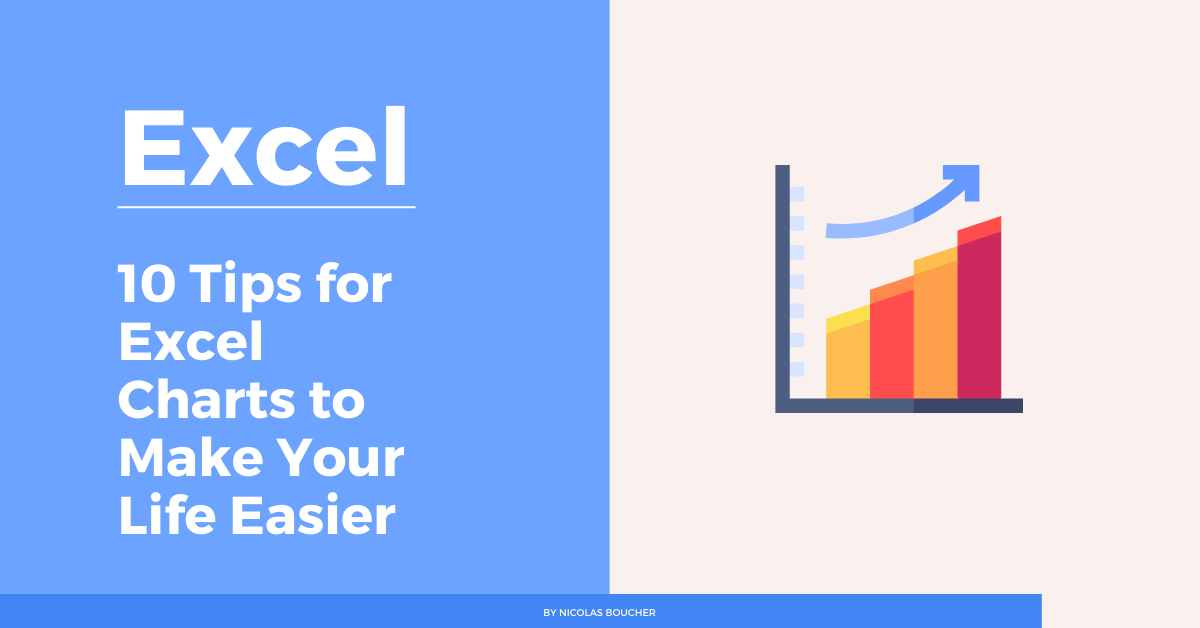
Top 10 Tips for Excel Charts
This tutorial trains you with the following tips:
- Quick Chart Creation: Learn to instantly bring your data to life using the ALT+F1 shortcut, saving precious time in your financial analysis.
- Selective Visualization: Master the art of selecting specific columns before chart creation, ensuring that only the most relevant data is showcased for your financial storytelling.
- Dynamic Expansions: Discover how to automatically expand your graphs as you add more columns or rows, keeping your financial charts always up-to-date without manual adjustments.
- Efficient Data Filtering: Gain insights on quickly filtering data directly from a chart, enabling you to focus on specific financial metrics or periods without altering your entire dataset.
- Leveraging PivotCharts: When your data isn’t summarized, PivotCharts become an invaluable tool for creating dynamic visual representations of complex financial data.
- Multi-level Labels: Enhance readability with multi-level labels, perfect for organizing detailed financial data into clear and understandable charts.
- Secondary Axis Utilization: Learn to create compelling combo charts using a secondary axis, which is ideal for comparing different types of financial data on the same chart.
- Dynamic Chart Titles: Connect your chart titles to spreadsheet cells, allowing for automatic updates and ensuring that your financial presentations are always accurate.
- Pie Chart Insights: Split off slices into a second pie chart for a detailed examination of specific segments, enhancing the clarity of financial distributions.
- Interactive Previews: Utilize the hover feature over Chart Elements for a real-time preview, making it easier to fine-tune your financial charts before finalizing them.
How Can Excel Charts Improve Your Work
In finance, where data drives decisions, Excel charts stand out as not merely tools for data visualization but as essential instruments for analysis, communication, and strategy. Understanding how to leverage Excel charts effectively can significantly enhance your work by:
- Enhancing Data Comprehension: Complex financial data becomes more digestible when presented visually. Excel charts help break down intricate datasets into understandable formats, making it easier to identify trends, patterns, and outliers.
- Facilitating Better Decision-Making: By visualizing financial data, you can make informed decisions swiftly. Charts allow for a quick comparison of different data points, enabling financial analysts and decision-makers to identify potential investment opportunities or financial risks at a glance.
- Improving Communication: Financial reports filled with numbers and text can be daunting. Excel charts offer a way to convey the same information more effectively, making it easier for stakeholders to grasp key messages and insights without getting lost in the details.
- Saving Time: With the capability to quickly generate and customize charts, Excel allows for efficient data presentation. This means less time creating reports and more time on analysis and strategy.
- Increasing Accuracy: Visual representations help in spotting errors in data that might not be evident in a tabular format. By plotting financial data on a chart, inconsistencies or anomalies become more apparent, leading to more accurate financial analysis.
- Customizing for Impact: Excel’s wide range of chart types and customization options means you can tailor your data presentation to your specific audience. Whether it’s a line chart to demonstrate financial trends over time or a pie chart to show budget allocations, Excel charts can be customized to achieve the desired impact.
Conclusion
You may start making better-looking charts in Excel more quickly and efficiently by using the charting tips and methods. However, these tips and techniques are just a portion of the material I provide in my customized course for finance professionals, where I teach them how to produce understandable visual representations of financial data and valuable finance knowledge.
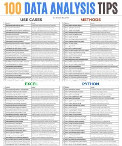
You can get the tutorial Excel file by clicking here and start training yourself to improve making charts in Excel and if you want to improve your productivity in Excel, grab my free top 100 Excel tips.
FAQ
1. What are the key benefits of using Excel charts in financial analysis?
- Excel charts offer several key benefits in financial analysis, including enhancing data comprehension by breaking down complex datasets into visual formats, facilitating quicker decision-making through visual comparison of different data points, improving communication with stakeholders by presenting data in a more digestible manner, saving time on report creation, increasing the accuracy of financial analysis by making inconsistencies more apparent, and allowing customization to tailor presentations to specific audiences.
2. How can I quickly create a chart in Excel for my financial data?
- You can quickly create a chart by selecting your data and pressing the ALT+F1 shortcut. This instantly generates a chart, bringing your data to life and saving precious time in your financial analysis. This shortcut is particularly useful for rapid visualization of financial trends and metrics.
3. Can Excel charts automatically update when I add more data?
- Yes, Excel charts can automatically update as you add more columns or rows to your dataset. This feature, known as dynamic expansions, ensures that your financial charts remain up-to-date without the need for manual adjustments. It’s particularly useful for financial analysts who continuously update their data with new financial periods or metrics.
4. How can I use Excel charts to improve communication in my financial reports?
- Excel charts improve communication by converting complex financial data into visually appealing and understandable formats. This makes it easier for stakeholders to grasp key messages and insights without delving into dense numerical data. By using charts, you can highlight trends, patterns, and anomalies in your financial data, making your reports more effective and engaging.
5. What is a PivotChart, and when should I use it in finance?
- A PivotChart is an advanced Excel tool that allows you to create dynamic visual representations of complex datasets. It’s especially valuable when your data isn’t summarized and you need to analyze it from different perspectives. In finance, PivotCharts are useful for summarizing large amounts of financial data, such as sales figures, financial performance indicators, or investment returns, enabling you to drill down into specifics and uncover insights that would be difficult to spot in traditional charts.