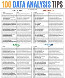


Visualization tools are crucial for transforming raw data into insightful, actionable information in data analysis.
Excel, one of the most widely used data analysis tools, offers a plethora of chart types that cater to different analytical needs.
However, as Excel offers many functionalities to visualize your data, there are some charts that you didn’t know existed or still haven’t tried out.
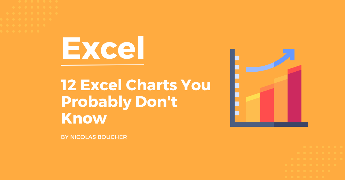
Today, I will analyze 12 Excel charts that you probably don’t know, each with its unique capabilities, how to create them in Excel and practical use cases for finance.
Table of Contents
The 12 Excel Charts You Need to Start Using
Here is everything you need to know about the charts:
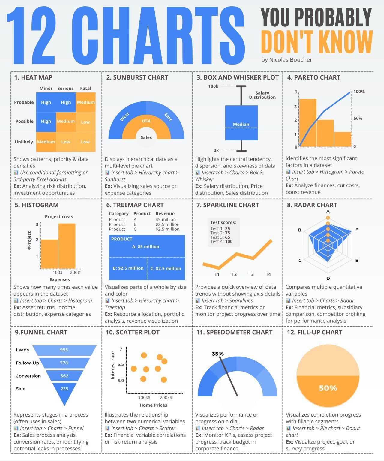
#1: Heat Map
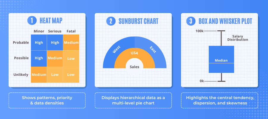
Description: Shows patterns, variances, and densities of data.
How to do it in Excel: Use conditional formatting or third-party Excel add-ins.
Use Cases: Analyzing risk distribution, financial performance across regions, or investment opportunities.
#2: Sunburst Chart
Description: Displays hierarchical data as a multi-level pie chart.
How to do it in Excel: Insert tab > Hierarchy chart > Sunburst.
Use Cases: Visualizing sales source or expense categories
#3: Box and Whisker Plot
Description: Highlights the central tendency, dispersion, and skewness of data.
How to do it in Excel: Insert tab > Charts > Box & Whisker.
Use Cases: Salary distribution across departments, Price distribution across products, Sales distribution across regions.
#4: Pareto Chart
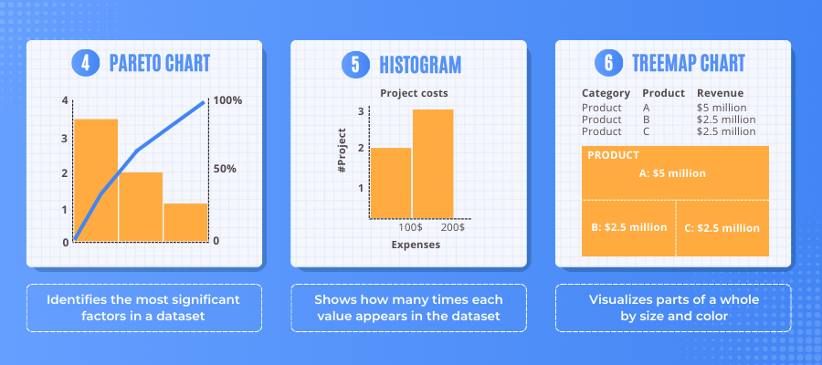
Description: Identifies the most significant factors in a dataset.
How to do it in Excel: Insert tab > Histogram > Pareto Chart.
Use Cases: Identifying major causes of financial discrepancies, prioritizing cost reduction efforts, or analyzing revenue sources.
#5: Histogram
Description: Shows how many times each value appears in the dataset.
How to do it in Excel: Insert tab > Charts > Histogram.
Use Cases: Distribution of asset returns, income level distribution, or expense categorization.
#6: Treemap Chart
Description: Visualizes parts of a whole by size and color.
How to do it in Excel: Insert tab > Hierarchy chart > Treemap.
Use Cases: Allocating resources, analyzing portfolio composition, or visualizing revenue streams.
#7: Sparkline Chart
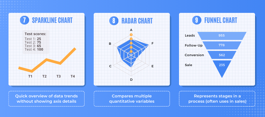
Description: Provides a quick overview of data trends without detailed axis information.
How to do it in Excel: Insert tab > Sparklines.
Use Cases: Tracking financial metrics over time or monitoring project progress.
#8: Radar Chart
Description: Compares multiple quantitative variables.
How to do it in Excel: Insert tab > Charts > Radar.
Use Cases: Performance analysis across different financial metrics, comparison of subsidiaries performance, or analysis of competitor profiles.
#9: Funnel Chart
Description: Represents stages in a process.
How to do it in Excel: Insert tab > Charts > Funnel.
Use Cases: Sales process analysis, conversion rates, or identifying potential leaks in processes.
#10: Scatter Plot
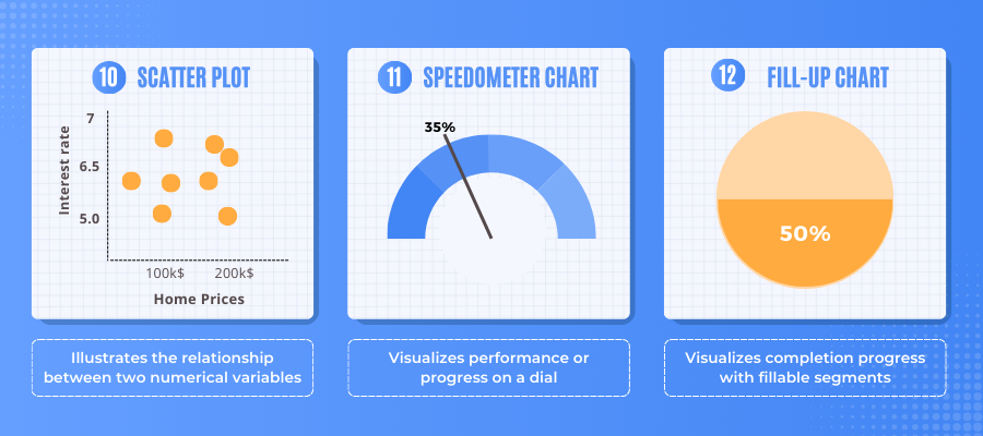
Description: Illustrates the relationship between two numerical variables.
How to do it in Excel: Insert tab > Charts > Scatter.
Use Cases: Identifying correlations between financial variables or risk-return analysis
#11: Speedometer chart
Description: Visualizes performance or progress on a dial
How to do it in Excel: Insert tab > Charts > Radar
Use Cases: Monitor KPIs, assess project progress, track budget in corporate finance
#12: Fill-up Chart
Description: Visualizes completion progress with fillable segments
How to do it in Excel: Insert tab > Pie chart > Donut chart
Use Cases: Visualize project, goal, or survey progress
Final Words
Mastering the use of various Excel charts can significantly enhance your data analysis capabilities. Whether you’re assessing financial performance, identifying key drivers of revenue, or tracking progress against goals, the right chart can make complex data more accessible and understandable.
FAQ
Q: What is a heat map, and how can it be useful in financial analysis?
A: A heat map is a data visualization tool that displays patterns, variances, and densities within a dataset using color gradients. In financial analysis, it is useful for identifying areas of high and low performance, such as risk distribution, financial performance across regions, or investment opportunities. By using conditional formatting or third-party Excel add-ins, you can create heat maps that provide quick insights into complex data sets.
Q: How do I create a Sunburst Chart in Excel, and what are its applications?
A: To create a Sunburst Chart in Excel, navigate to the Insert tab, click on Hierarchy Chart, and select Sunburst. This chart type is excellent for displaying hierarchical data as a multi-level pie chart, making it ideal for visualizing data like sales sources or expense categories. It helps in understanding the composition and relationships within your data at different levels.
Q: What is a Box and Whisker Plot, and when should I use it?
A: Box and Whisker Plot, or Box Plot, is used to display the central tendency, dispersion, and skewness of data. In Excel, you can create it by going to the Insert tab, selecting Charts, and then choosing Box & Whisker. This plot is particularly useful for comparing distributions, such as salary distributions across departments, price distributions across products, or sales distributions across regions.
Q: How can a Pareto Chart help prioritize financial analysis efforts?
A: A Pareto Chart identifies the most significant factors in a dataset by displaying values in descending order of frequency. To create one in Excel, go to the Insert tab, select Histogram, and then choose Pareto Chart. This chart is valuable for highlighting major causes of financial discrepancies, prioritizing cost reduction efforts, or analyzing revenue sources, helping you focus on the areas that will have the greatest impact.
Q: What are the advantages of using a Scatter Plot in financial analysis?
A: A Scatter Plot illustrates the relationship between two numerical variables, making it an effective tool for identifying correlations. In Excel, you can create a Scatter Plot by navigating to the Insert tab, selecting Charts, and then choosing Scatter. This chart type is particularly useful in financial analysis for identifying correlations between financial variables, performing risk-return analysis, and exploring relationships between different financial metrics.